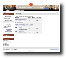
Common Look and Feel Standards in a Drupal Theme
on
 For those in the theming world, Common Look and Feel for the Internet 2.0 (aka CLF) is the source of many hours of CSS tinkering and artistic compromise but necessary if you want to make a Government of Canada compliant website
The context of CLF is noble:
Canadians have the right to obtain information and services from Government of Canada Web sites regardless of the technologies they use. The key to effective implementation of universal accessibility lies in designing sites to serve the widest possible audience and the broadest possible range of hardware and software platforms, from adaptive technologies to emerging technologies.
...and the requirements for CLF make sense:
1. Compliance with World Wide Web Consortium Priority 1 and Priority 2 checkpoints
2. Baseline technologies for Web page markup, layout and design. (XHTML 1.0 Strict and Cascading Style Sheets 1.0)
3. Accessible alternate format of documents on Web sites
4. Offering information in multiple formats
5. Contrast
6. Assessing accessibility, interoperability and usability
Now how do we apply this to the Drupal framework? For starters, you can read the many, many pages of the guidelines. Doing so doesn't make the task any easier. The best advice is to find an existing CLF theme. There are a few out there and the quailty varies.
CLF regulations dictate every pixel of a theme. There are 4 guidelines for the maple leaf alone (ie: the top of the leaf must be placed 5 pixels below the bottom of the final text in the institutional signature).
The first item that stands-out is: The page width is 760 pixels. As a themer, trying to fit all the content into a horizontal space of 760 pixels is not easy, especially if there are 3 columns. This makes for crammed content... was this put in place for all the government blackberry users? or for all the grandmothers in rural Canada using a 386 computer with a 10 inch monochrome monitor? Either way the standard is in place and you'll just have to conform (get used to this).
There are many items that are very puzzling from a design standpoint like putting the URI in the header.... isn't this what the address bar is for? Again, the secret to succesful CLF theming in Drupal is doing as why!
In the Drupal context, you'll find there is a lot of conflict between the CLF theme and module specific css files, specifically elements that use the CSS clear property. Basically, this property is ensuring that there is lots room on both sides of the element... of course with CLF, there is not much room to begin with. The big problem is that the clear property is that floating elements are not allowed and in a table-less theme, the sidebars float, so the element ends up beneath the each other. The solution is to change the tag to clear:none
Another big problem is the tabs on the user page. If you have too many tabs, then the content ends up below the left side bar. It seems half of the modules installed needs css adjustments.
So you've finally completed your drupal theme. Now you can check it against the 100 or so items on the 'Compliance Checklist for Web sites'. Don't forget that a new CLF 2.0 is being put into place for December 2008, rendering the old 1.1 theme obsolete.
In conclusion, creating a CLF compliant theme is no simple task. I'd suggest working off an existing CLF template rather than working from scratch because there are so many fine details, css files, folders and images - remember these standards where written by the Treasury Board of Canada Secretariat and not Website Developers.
Share this article
About The Author
Mike Gifford is the founder of OpenConcept Consulting Inc, which he started in 1999. Since then, he has been particularly active in developing and extending open source content management systems to allow people to get closer to their content. Before starting OpenConcept, Mike had worked for a number of national NGOs including Oxfam Canada and Friends of the Earth.


