
Personalization & Accessibility with Drupal
on
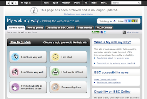 Accessibility is complicated. There is no single site that is universally accessible. One of the best initiatives I've seen by an organization was the BBC with their My web my way accessibility section. Unfortunately, they have decided to archive it and stop maintaining these pages. It is unclear to me whether any of the personalization options defined here will continue to be supported or not within the BBC. I do think that sites could do more to help explain how their users can get the most out of their site. Most sites who do this put it alongside their Accessibility Statement.
I'm on record for being opposed to text resize widgets. You can see the long thread, but ultimately I came to the conclusion that the browser gives far more control over the size of a website than either CSS or JavaScript solutions. By using Control-plus (or Command-plus on a Mac) it is easy to make the text as big as you like. Teaching users how to use their browser is far more useful, than ensuring that there is a limited widget that gives users some options to adjust the text size. The AAA or TTT text resize button is the most common accessibility widget that I've come across. Most of the time they offer very few options to increase/decrease the font size.
The second most common accessibility widget I've seen is for colour contrast. Usually, it's simply a matter of swapping colours and having a dark background rather than a light one. Occasionally a website will be built that allows for yellow/black or yellow/blue colour combinations. Very rarely is a low colour contrast an option in these widgets. Some users with Dyslexia benefit from having a low contrast. According to The Yale Center for Dyslexia & Creativity, up to 20% of the world’s population could be struggling with dyslexia. That's a lot of users who are being overlooked.
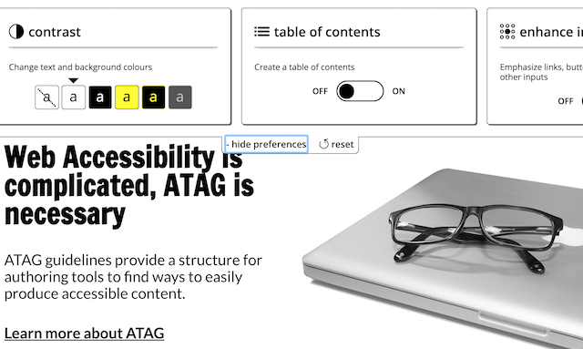
In trying to find a better solution for a client we stumbled into The Fluid Infusion Framework, a project of the Inclusive Design Research Centre at OCAD University. The Preferences Framework that the Fluid Project is developing seemed to meet all of our criteria, and then some. With this simple framework we could ensure that there was an easy way to adjust the text size and text/background colour, but also allow users to change the font, adjust the spacing, add a table of contents and enhance links/forms. There is even a Text To Speech component that uses Web Speech Synthesis API read the page to you. Both the Fluid software and documentation are licensed under very permissive licenses to make it easy for adoption.
"Fluid is an open, collaborative project to improve the user experience and inclusiveness of open source software."
 I was convinced of its usefulness. There was even an existing module for it in Drupal. Unfortunately, the module was abandoned and hadn't kept up with either Drupal or the Fluid project. We have now contributed code back to the community to address this in both Drupal 7 and 8. We want to see this pattern be more widely implemented on other sites.
This library is quite extensive, but developers are still responsible for a few things.
- If an element is set with a size in px it will not be resized. Only values set with relative sizes (e.g. em, rem) will be resized.
- Try not to place text in elements that have a specified line-height. Unfortunately, the line spacing enactor isn't able to adjust the line-height for these elements.
- Don't override CSS with !important as it can't be overridden by the widget and usually isn't a good practice.
- Remember to test your site out with a wide range of options. You may want to swap out images or use SVG files that allow you to modify the background fill using CSS.
I have to end off with a note about Comic Sans. It's a font which most people hate, but that is very good for some users. I believe that the Fluid Project will be moving it to OpenDyslexic in the near future as some people prefer it. We will probably add it as an option in the near future. We've been somewhat involved in the debates around the usefulness of these fonts and even created one at one point. This gives people an easy means to customize how they want to consume the content. Ultimately, if it is easy to give someone the ability to switch the fonts, why not let them?
In 2017 the W3C set up a Personalization Task Force which is developing a Personalization Semantics Explainer which is looking to provide guidance on how to tailor aspects of the user experience to meet the needs and preferences of the user. It will be quite interesting to see how the W3C Working Draft evolves.
Share this article


About The Author

Mike Gifford is the founder of OpenConcept Consulting Inc, which he started in 1999. Since then, he has been particularly active in developing and extending open source content management systems to allow people to get closer to their content. Before starting OpenConcept, Mike had worked for a number of national NGOs including Oxfam Canada and Friends of the Earth.